


Why the Ocean Looks So Fake on Google Maps
Google Maps. Ah, yes, the world’s go-to app for figuring out just how late you’re going to be to that thing that started, oh, six minutes ago. It’s also, if you’re anything like me, a fascinating place to stare at what I’ve affectionately dubbed “the great spots of foreshot”—those oddly uniform patches of water-looking water amidst what can sometimes feel like a sea of Papa Smurf’s aging, leathery skin. I was, in fact, halfway to setting up a gift shop dedicated to these “great spots” when someone, rather unceremoniously, pointed out that these spots aren’t, well, *real*. They’re just how the clever folks at Google choose to represent water. Because, let’s be clear, the actual water in the Gulf of Mexico looks like, well, water (when it’s not looking like oil, that is). So, it begs the question: why does an app that shows satellite images of land so detailed you can count individual horses, fake its water? What on Earth are they hiding beneath that hypnotic blue expanse? Let’s dive in.
The Mosaic of Our World: How Google Maps is Built
To really get to the bottom of this, we need to understand how Google Maps actually works, and more specifically, why you can zoom in on it the way you do. Now, depending on who you believe, the Earth is, in fact, round. And because of that, this fully zoomed-out Google Map, which presents as a flat square, is inherently distorted in places. On maps like this one, areas near the equator tend to be the least distorted, while places like Greenland look absolutely enormous, even though it’s, surprisingly, smaller than a new country I just made up called Fiji Arabia. Or, to put it another way, if you look at a bunch of circles that are actually the same size on a globe, they’ll look wildly different on a flat map. And if you’re thinking, “No, they’re not!” Well, exactly.
But here’s the magic: if you zoom in on any given point on Google Maps, it gets less and less distorted as you go. This isn’t because the fully zoomed-out Google Map is one giant picture that you’re just getting closer to. Zooming isn’t a magnifying glass; it’s more like a portal to better, more detailed pictures. You see, the map itself is actually a collection of “tiles”—a bunch of little images mosaiced together to form one big one. And as you zoom in, Google Maps stealthily transitions you from looking at one image to a closer-up one, and then to an even closer-up one.
Google Maps boasts about 21 zoom levels in total. At level zero, you’re looking at a single 256×256 pixel tile that contains the entire world. Every time you zoom in a level, that same 256×256 pixel tile now represents a quarter of the area of the previous tile. So, the picture becomes four times more detailed. While the whole world fits on one tile at zoom level zero, by zoom level 21, the world is two million tiles wide and contains over four trillion tiles in total. To give you a sense of scale: at zoom level 1, Everglades National Park fits on a single pixel. By zoom level 20, a pixel barely covers two iPhones. It’s this intricate tiling system, this way of piecing the world together, that makes representing the ocean so incredibly difficult.
- Map Distortion: Flat maps distort the spherical Earth, with areas near the poles appearing larger than they are.
- Tiling System: Google Maps is composed of numerous small image “tiles” stitched together.
- Zoom Levels: Zooming in transitions users to higher-resolution tiles, not just magnifying a single image.
- Scale: From a single tile at zoom level 0 to trillions of tiles at zoom level 21, showing immense detail on land.
The Elusive Ocean: Why Water is So Hard to Photograph from Space
This tiling system means that each individual image snapped of Earth and uploaded to Google’s massive mapmaking machine has to be meticulously stitched to a bunch of other ones. The goal? To make all these tiles look like part of one big, continuous whole. How do they achieve this for land? Well, it’s relatively straightforward. We know where the satellite was and which direction it was pointing. More importantly, there are distinguishing features everywhere: buildings, roads, hard lines. These elements make it really easy for algorithms—like one called SIFT or another named AERoix—to match an image with others of the same place. They use a few patches of distinct, high-contrast pixels to pinpoint the image’s exact location on a map. So, knowing you’re looking at Port Fourchon is easy. Even as you venture out onto the water, if there are distinct features like a small island, the algorithms can still tell you where you are.
But eventually, you’ve gone too far. Look at a picture of the open ocean. What in that picture could possibly pinpoint its location? What collection of pixels is unique enough to this part of the Gulf of Mexico that you wouldn’t just drop it in the Pacific and clock out? A wave? A glint of sunlight? The shadow of a fish? Of course not. All those things move. And how would you possibly line this up with pictures of adjacent chunks of the Gulf of Mexico unless they were all taken at the exact same moment? The water would look totally different from one second to the next, let alone one day to the next. Even having distinct features nearby won’t save you. You might geolocate based on a little island, but the water itself changes appearance constantly. My editors tried to stitch together a few pictures of water to make a big picture of water, and, well, they just made a mess before giving up and going back to land.
On land, the same distinct, permanent features used to pinpoint photos are also used to stitch them together. Once an image has undergone atmospheric correction (meaning water vapor and other atmospheric conditions are edited out) and orthorectification (accounting for how changes in elevation might distort it), it gets stitched to its neighbors. There are a few ways to mosaic satellite images. You could just line them up as best as you can, but that leaves harsh transitions. Or you could feather or smudge them together, hoping for the best. But the most common method these days involves cutting photos together using something called seam lines. This means you don’t just line pictures up along their borders. Instead, you cut your images into funky shapes based on the starkest lines within them and then line them up that way. Why? Because it’s weird if two halves of a building mismatch, but not so much if separate buildings on opposite sides of a road do. So, back to the ocean: what would your seam line look like here? Again, I asked my editors to do it, but they just, uh, made me this.
But geolocation and stitching aren’t even the only problems. Water is just straight up hard to photograph from above. For starters, it’s what’s called a specular reflector. This means that, sort of like a mirror, almost all the light that hits it bounces off in a dome shape, going every which way. The result? Direct sunlight creates a weird ocean smudge in satellite images that can make the water look brighter than the land. Do you want that in your Google Maps? Of course not.
- Lack of Fixed Features: Unlike land, the ocean lacks permanent, high-contrast features for algorithms to use for precise geolocation and stitching.
- Constant Movement: Waves, sunlight glints, and shadows are constantly changing, making it impossible to align images taken at different times.
- Specular Reflection: Water acts like a mirror, scattering light in all directions, which creates bright “smudges” in satellite images, making it difficult to capture clear, consistent visuals.
- Seam Line Challenge: Without distinct lines or features, creating seamless transitions between ocean tiles is virtually impossible.
The Business of Blue: Economic Realities and Google’s Approach
Then, of course, there’s the rather inconvenient fact that basically nobody with a commercial satellite wants to take pictures of the open ocean. Why? Because basically nobody wants to buy those pictures. And they’re not exactly free for satellite companies to take or transmit down to Earth. I mean, we asked SkyFi for a picture of a patch of the Atlantic, but that’s just because we’re a bunch of sickos, and because I think I lost one AirPod there on one of my yachting trips with Brian from Real Engineering. This image here shows one month’s imaging plan for a single commercial satellite. Notice anything? It’s all land.
And it makes perfect sense, doesn’t it? Google Maps is primarily designed to show you whether you’re near a Cheesecake Factory or how to get from point A to point B. Why would Google waste valuable time and resources creating a zoomable satellite image of the entire ocean when you, the user, almost never use it? They can’t get businesses to pay to show up in it, and let’s be honest, half of you still keep Maps in map view instead of satellite anyway. Have you no interest in seeing the Bean from above?
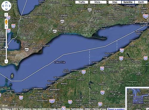
So, what does Google do instead? Well, they create “the expanse,” that big, beautiful blue mass we all know and love. This isn’t live satellite imagery. Instead, it uses data from sources like the General Bathymetric Chart of the Oceans, or GEBCO, to kind of, sort of estimate the topography of the ocean floor. You know, for texture. Not that we actually *know* the topography of the entire ocean floor; it’s mostly educated guesses and vibes based on the bumps and valleys of the surface. But, you know, who cares? It looks good enough in the app. And again, almost nobody looks at it, except for us curious few. In honor of the good and too often unsung work of the Google employees behind “the blue expanse,” let’s just admire it for a moment over some smooth jazz. Lovely.
In all, the Google Maps map is made up of billions of images from satellites, airplanes, and street view cars, even backpacks, that combine to give you two-meter accurate images of where stuff is on land. In the ocean, you don’t need that. Because if you’re here, sorry buddy, you’re already dead.
- Low Commercial Demand: Commercial satellite companies have little incentive to photograph the open ocean as there’s no significant market for such images.
- Costly Data: Capturing and transmitting ocean imagery is expensive.
- User Behavior: Most Google Maps users primarily interact with land-based features, making detailed ocean imagery a low priority for Google.
- Synthetic Ocean: Google creates the ocean’s appearance using bathymetric data (estimates of the ocean floor’s topography) rather than actual satellite photos.
- Purpose Driven Mapping: Google Maps prioritizes mapping areas where users need detailed information for navigation and points of interest on land.
Key Insights into Google Maps’ Ocean Display
- Google Maps uses a “tiling” system, where zooming in reveals progressively more detailed images, rather than simply magnifying a single large map.
- Mapping the ocean with real satellite imagery is incredibly challenging due to the lack of fixed, distinct features, constant movement (waves, light), and water’s reflective properties (specular reflection).
- Commercial satellites have little financial incentive to capture vast amounts of open ocean imagery, as there’s low demand and high cost.
- Google’s “blue expanse” for the ocean is largely a generated representation based on estimated bathymetric data of the ocean floor, not actual satellite photos.
- The accuracy of Google Maps’ land imagery (down to two meters) is a stark contrast to its ocean display, reflecting user needs and economic priorities.
The Art of Mapping: Balancing Detail with Purpose
Our little dive into the depths of Google Maps’ ocean display reveals something rather fascinating about how our digital world is constructed. It’s a testament to the incredible engineering behind these platforms, but also a stark reminder that even the most advanced technology makes choices based on practicality, cost, and user needs. The “fake” blue ocean isn’t a sign of hidden secrets or technological failure; it’s a clever, efficient solution to a complex problem. We’ve learned that mapping the ever-moving, featureless expanse of water from space is a monumental task, both technically and economically, that simply isn’t worth the effort for a map primarily designed for land navigation. So, the next time you’re scrolling through Google Maps and admiring that serene blue, remember the ingenuity behind its deceptive simplicity. It’s a beautiful, functional compromise that allows us to navigate our world, even if parts of it are more art than science.